And we're done here...
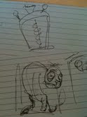
Eyegore started as a three person project with no programmer and all of us staring uncomfortably at a blank screen. It finished as a side scrolling platformer featuring a ne'er-do-well hunchback and his travels through a dangerous castle.
Concept!
 We knew without a programmer that we would have to keep the game focused and realistic for our skill level. Unity classes at VFS taught us how to move right and left, add velocity and write stuff on the screen. We could work with this.
Pre-pro gave us an ambitious (9 traps! Multiple interactions! Full ranking and scoring systems!) plan. Time-wise, this proved a little over-ambitious and we cut out the extra stuff. More traps would be great, but also would be overwhelming for players in a 5 minute experience. A ranking system started running counter to the game design as people found their fun in killing Eyegore as many times as possible in a level as opposed to completing the game as soon as possible. After alpha, we made some serious cuts and got the game in working order.
Redesign!
However, alpha had another set of challenges. We had been ignoring the people saying 'but is it funny'. We assured them that, yes, it eventually would be funny. Just... not right now. But why wasn't it funny? That's a real problem and it threatened to derail us. The game hinged on humour and we just weren't bringing it.
This prompted a redesign on sound, some art and animation. A bunch of assets were scrapped and reimported. We brought the game back in line with what we wanted from it.
From there on, features and fixes were the words of the day. We brought a (mostly) working copy to the table on industry night. There were some collision issues that continued to elude us, but all in all it was a solid little piece of work.
Industry night!
Seemed to be a bit of a love/hate thing. We took a chance in our presentations with using a specially designed demo level. We found that we had a lot of trouble directing the viewer's gaze with our playable levels. So much shiny! It worked well for some, not so well for others. We got dinged a couple times in feedback for presenting an 'unfinished' game level. Ouch. :(
We got some excellent feedback in person though. Some great thoughts on how to make the game more casual, and how to make it more hardcore. Someone called us the most 'hardcore art game'. Interesting for us since we felt we skewed way into casual, but it was pointed out that the lack of direct instructions in a game (do this X times or lose) actually skews the game hardcore.
Very cool to get different perspectives on this.
Final thoughts!
All done now, and what a ride. It was a great experience working both within our team, and with the other teams in the class. It's left me wanting to do more, and make better games (and hey, now I can program... a bit).
Oh, and see my portfolio at larissam.ca.
No comments:
Post a Comment