Thursday, June 30, 2011
Eyegore - Post Mortem
Things to Know About Unity if You Don't Have a Programmer
I was the programmer, but I am not a programmer. I learned tons and it was an awesome experience, but there were some hard Unity lessons along the way. Learn from our pain.
1) Always check your animation frame rate. We discovered that Maya was set to 24 FPS and Unity was set to 30 FPS for animation. When you import a 24fps animation into Unity, it pads the frame count to make it 30fps, leaving all your animator's frame numbers useless. Always ensure frame rates are proper in your animation program before exporting.
2) Keep consistent pivot points. You can center the pivots in Unity, but the only ones that matter are the local ones on the object. We had issues where I was destroying and instantiating objects and the instantiated platform was way off position because the pivots were in a different place.
3) Prefabs are awesome! Prefabs allow you to make a prop, platform, enemy and so on and drop them into a scene. If you make a change to one copy of the prefab and apply it, all copies take on the same properties. It's a lot easier than finding 200 individual items in a scene and manually changing them. By the time the end of the project rolled around and the levels were getting dressed up, the prefab thing was not followed. It was ugly and wasted a lot of time.
4) Create prefabs on empty game objects. I learned this early on. For example, I created Eyegore using the animation as the base of the prefab. When we changed the animations and I had to re-import that model, I ended up having to redo all the program links, triggers, colliders, lights, effects and a bunch of other stuff. Creating a prefab on an empty object makes animation or other components just a module you swap out and is very useful.
5) In your hierarchy view you can drop an empty game object into it and use it like a folder. For example, and empty game object labelled 'Walls'. Then in hierarchy you can drag all your in-scene walls into that game object and massively reduce clutter. These may not transfer between builds... at least my team swears they were using them when I turned around enraged at the spaghetti in my hierarchy folder.
6) Animation events are awesome. The documentation for them is great except for one little note. If you have not created the animation in Unity and instead have imported it, animations are read-only. Go into your animated object, and duplicate the animation. I made a folder called 'Edited Anims' and drop it in there with a name like WalkEdit. Replace it in the object's properties. Now you can edit the animation in the event editor.
7) Use colliders instead of triggers where possible. Holy cow, this caused so many spawning issues for us. If your character dies when he hits a trigger, welcome to 300 respawns! Where you need to use a trigger, Mat showed us an awesome couple lines of code that will prevent a character from respawning in the same frame (and can easily be adapted for a longer time scale).
8) Unity's collision can be a little fussy at times. I was experimenting near the end with discrete vs interpolated collision but didn't come up with a definitive answer on the way to go before we finalled. We ended up burying triggers in the middle of solid volumes because having the character fall would often hit triggers a full body width away due to interpolation.
9) Never use cloth physics if you want to pause the game. Cloth plus time.scale = divide by zero. It will kill your game.
10) Sound is fun! It defaults to logarithmic drop off. We did not know that. I had the listener on the main character and the source on the camera. They were too far away and you could barely hear the sound. Log dropoff is really best for localized, repetitive sounds (like the constant crush of a cycling trap, or a local siren). Use linear for sounds you want to hear anywhere or that are one offs (main character noises).
11) Along the same theme, if the sound if still distorted or has strange volume issues, switch it from 3d to 2d. It will clear right up in many cases.
12) Fun fact: if you're doing a side-scroller, a cube collider will act with some weird drag and push the character off the axis. We used a capsule collider and a z-lock script for movement to keep him on track. This also happens to things pushed or pulled along the axis. A quick script will lock them in place. Just make sure your levels are built along the same axis or he'll be free falling.
13) Particle effects are very cool. Unity standard comes with a number of very neat ones that can be updated and changed for your project so you don't have to start from scratch if all you want is a flame or explosion.
14) 'While' loops are bad. Very bad. Worse than cloth/Time.scale bad. It's divide by zero then divided again by zero bad. Anything in an Update function acts like a 'while' statement. So, no while statements, mmm'kay?
15) Don't worry if your code is ugly, as long as it works. By the time the last build rolled around, I was a little embarrassed by my earlier code. It was clunky and there was more efficient ways to do it. However, it worked. I'd rather have ugly and effective than sleek and non-functional. Just get used to saying 'Yeah, I know" with a shamed grin when a real programmer reads your code and gives you a disappointed look.
Good luck and have fun!
Monday, June 20, 2011
Eyegore finished!
For those of you who did not get the chance to play Eyegore you can download it here! http://projects.myvfs.com/games/games/GD18_Eyegore/EyegoreGame.zip
i really enjoyed working on Eyegore and am very proud of our final product. I got to work with a great team and we accomplished a lot in the short three month time span. It was my pleasure to work on all of audio of Eyegore. Making the world of Eyegore sound dangerous as well as adding some humor touches to it as to not take Eyegore completely serious. The audio and world of eyegore started off too serious for what we origionaly designed it too. We wanted to make it fun and amusing to hurl Eyegore into traps and objects and not make it realistic and dark. For this I had to re-design a lot of the sounds from realistic to cartoony to compliment the new style of our game!
As well as the Audio for Eyegore we also had to design levels where it forced the player to die and learn the multiple ways to use corpses. This proved to be more challenging than we originally anticipated. This forced us instead of making large sandbox style levels where we wanted players to explore and solve the level their own way, to create smaller single screen sized levels where players would be forced to learn the mechanics one at a time as to not get overwhelmed. In the end players string everything they learned into the larger levels that encourage players use that knowledge and explore.
in closing
The experience of working on Eyegore was great and I had the pleasure of working with Blackwell and Larissa on the game. Now its portfolio time and off to job hunting! You can view my portfolio at TimWirch.com
Happy gaming and i hope you try Eyegore out and let us know what you think!
Remember Dead or alive, Eyegore is useful either way
Concept to Complete
And we're done here...
Eyegore started as a three person project with no programmer and all of us staring uncomfortably at a blank screen. It finished as a side scrolling platformer featuring a ne'er-do-well hunchback and his travels through a dangerous castle.
Concept!
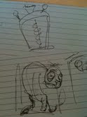 We knew without a programmer that we would have to keep the game focused and realistic for our skill level. Unity classes at VFS taught us how to move right and left, add velocity and write stuff on the screen. We could work with this.
Pre-pro gave us an ambitious (9 traps! Multiple interactions! Full ranking and scoring systems!) plan. Time-wise, this proved a little over-ambitious and we cut out the extra stuff. More traps would be great, but also would be overwhelming for players in a 5 minute experience. A ranking system started running counter to the game design as people found their fun in killing Eyegore as many times as possible in a level as opposed to completing the game as soon as possible. After alpha, we made some serious cuts and got the game in working order.
Redesign!
However, alpha had another set of challenges. We had been ignoring the people saying 'but is it funny'. We assured them that, yes, it eventually would be funny. Just... not right now. But why wasn't it funny? That's a real problem and it threatened to derail us. The game hinged on humour and we just weren't bringing it.
This prompted a redesign on sound, some art and animation. A bunch of assets were scrapped and reimported. We brought the game back in line with what we wanted from it.
From there on, features and fixes were the words of the day. We brought a (mostly) working copy to the table on industry night. There were some collision issues that continued to elude us, but all in all it was a solid little piece of work.
Industry night!
Seemed to be a bit of a love/hate thing. We took a chance in our presentations with using a specially designed demo level. We found that we had a lot of trouble directing the viewer's gaze with our playable levels. So much shiny! It worked well for some, not so well for others. We got dinged a couple times in feedback for presenting an 'unfinished' game level. Ouch. :(
We got some excellent feedback in person though. Some great thoughts on how to make the game more casual, and how to make it more hardcore. Someone called us the most 'hardcore art game'. Interesting for us since we felt we skewed way into casual, but it was pointed out that the lack of direct instructions in a game (do this X times or lose) actually skews the game hardcore.
Very cool to get different perspectives on this.
Final thoughts!
All done now, and what a ride. It was a great experience working both within our team, and with the other teams in the class. It's left me wanting to do more, and make better games (and hey, now I can program... a bit).
Oh, and see my portfolio at larissam.ca.
Monday, June 13, 2011
VFS Industry Night Impression
The constructive comments were also very helpful. we need to work on our death animations to further sell the point and the humor. One piece of design commenting stood out that each of the levels should have had Eyegore attempting to do something before going to the door rather than just straight on navigation, which I found intriguing. I like the idea of a goal to complete beyond the end, lending itself to a larger plan for the game. Something to ponder.
As a whole I think Eyegore stood us very well and will continue to do so as we tweak and improve it down the road. See Blackwell's portfolio here bhird.com
Monday, May 30, 2011
FINISHED!
Once we have our industry night done or at least dealt with, we will post more images of the final game.
Tuesday, May 3, 2011
Eyegore around town
Our window was no exception
Wednesday, April 20, 2011
The Art of Pain
Friday, April 15, 2011
Wait...
Jazz Hands!
Saturday, April 9, 2011
Truth, Lies and Project Management
I'll talk about codin
 g another day, but for now I'd like to look at being the project manager of a 3 person team.
 At one point we were asked to describe our style of management. Somewhat confused, I replied "Tyranny?". Apparently they were asking about Agile versus Waterfall. Pfft. Whatever. The point is, the world's in a mess and I just need to rule it... I mean manage the project. Yes.
Given that there are three of us and we have a metric crap ton of work to get done, it's obviously not feasible for me to be a full time PM. I look at it more as a project coordinator. A facilitator of projects, as it were. So what is the key to managing a small team with a lot of work and very little time? Well, it helps if the team is receptive to being managed. Luckily, this team is. And done! Okay. I'll try and break it down further.
Sprints
We start every Monday with a short meeting. I go over the
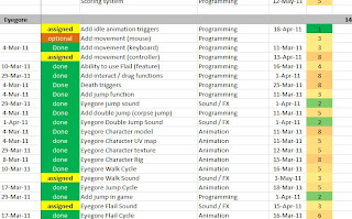
 task list (excerpted in really tiny script above for your viewing pleasure) and we assign a sprint for the week.
It's an unholy blend of agile and waterfall where the 'due dates' we came up with in pre-pro function more as a guideline and not a rule. They gave us a rough idea of the priority of the tasks to be done, but are not set in stone.
Each person has their own colour of stickies so they can easily see if there are any dependencies (I stack related stickies, so that the yellow at the bottom is waiting for all the top stickies to get done). I first ask if anyone has a preferred task set they want to complete, and assign that. After that, or if there are no preferences, I start writing sticky notes until my target starts to whimper.
The key here is knowing how your team works. That's rough at first, but it's important to get a sense of the pace of work, and how well your team members estimate time. I've been tracking this just to make the numbers official, but I feel pretty confident that 80 - 90% of what I assign in the week is doable (the remaining is there to allow some flexibility in how we work or for priorities to be rearranged).
The sticky notes are up for the week, and I mark the task as assigned in the spreadsheet. When a task is complete, the team member leaves the sticky note on my desk, I tick it off the task list and toss the finished sticky onto the pile.
The Spreadsheet
The fastest way to get s
 omeone to leave you alone is to open some giant, multi-coloured spreadsheet. Most people have an innate fear of Excel and will immediately back away. We have such a spreadsheet. It was based on a template I found in the Necronomicon and we've been pretty happy with it (except for the faint sobbing noises you hear late at night when it's really quiet).
 Really, the only point of setting up a spreadsheet is to catch all the minutiae of game design. Not every group will want or need this. It depends on your style and organization. I have no style and terrible organization, so spreadsheet it is!
The task list is really broken down into small detail. For example: the Brain's model, UV, texture, move animation, idle animation, script, voice recording, voice processing and adding each component into code are all individual tasks. I could have simply put "Brain - 20 hours" but that really doesn't tell us dependencies and it's a lot harder to estimate time on a monolithic piece of work like a major game character. Currently, the game's main character Eyegore has 33 sub-tasks to be completed just to get him in game and working.
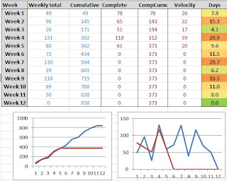
I made a quick set of graphs up for the team. You can see them above. The blue line is projected work done, the red is actual work done. I got rid of all the stuff we purged from the project and it's actually kind of cool how well they're matching actual and expected. Woot?
Originally the graphs were set up to check for outliers, like the time I had to say "Hey guys? We have 36 days of work planned for this week's sprint?". That's the time to go back and rebalance the workload. That's easier with an agile system, but you always have to keep a tight rein on the backlog or else it's going to be week 12 and people will be sobbing under their desks (more than usual).
One really important thing to note is that nobody cares about your spreadsheet but you. Seriously. Mine's covered with graphs and arcane formulae, but they only matter to me and only insomuch as it helps keep the team on track. Numbers can be absurdly fun to crunch (oh god I'm a nerd), but keep them relevant and understand their meaning and why you track them. Also understand that if you ever hand in your spreadsheet, you will be expected to explain it. So, that's where the lies come in.
I've said too much.
(The average reaction to seeing a project manager's spreadsheet)
Thursday, April 7, 2011
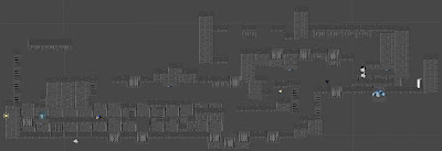
i'm Tim Wirch, Lead level designer and audio guy for Eyegore!
here posted is an early whitebox level for Eyegore. This was for our testing the traps out as well as multiple pathing options and to see how long our levels for our vertical slice slice should be.
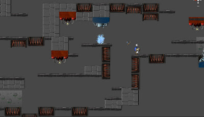
as you can see we now have textures for most of the wall tiles as well as for the traps and Team whimsy now has particle effects on the traps and sounds for the traps as well!
Tuesday, April 5, 2011
Eyegore the First
Welcome to Eyegore
I'll start my description of Eyegore with an anecdote. When I was 12, I played my first game of D&D. At the behest of a fellow 12 year old, I painstakingly created a barbarian. We lovingly crafted all my skills, my gear and my various and sundry items I was carrying.
Proud of my creation, I took my first step into the GM's world.
And I died to a trap on the door into the dungeon.
This brings us full circle to Eyegore, a game where you die to traps instantly and repeatedly. An homage to all sadistic 12 year-olds everywhere, I guess.
We're taking the sting out of death, making it fun, funny and important. Going against the gamer instinct for self-preservation, we invite you to toss Eyegore gleefully into ice, fire, spikes, and electricity as you travel through the castle. We hope you enjoy this look at development and the game it becomes!


